PART 2 – The dataset and first exploration
After hitting golf balls with our fairway wood golf club (3 wood) on the driving range, we got data and we need to select the relevant ones.
So we have decided to keep and build our dataset with this:
- ball Carry
- ball Speed
- ball Apex
- ball Launch Angle
- ball Dispersion
We have a dataset which was cleaned and normalized with Python process. This dataset now looks like this for balls hit by a our fairway wood golf club:
| Carry (meters) | Speed (km/h) | Apex (meters) | Launch Angle (degrees) | Dispersion (meters) |
|---|---|---|---|---|
| 188 | 131 | 26 | 14.8 | 5.3 |
| 176 | 126 | 37 | 20.7 | 37.6 |
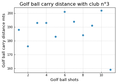
We have this scatter plot for 10 golf shots. Of course, we could do it with 100 or 1000 golf shots but time, cost and light bulbs in hands were our limits:
As we want to understand what influence the carry distance of the golf ball, we can draw on a regressive pairplot the relationship between the features and this distance.
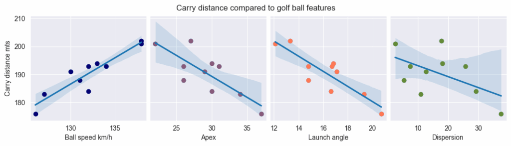
We can observe quicky via the the help of the trend lines that:
| Variable | Effect on Carry Distance | Interpretation |
| Ball Speed | Strong positive | As ball speed increases, carry distance rises sharply. This indicates that higher impact energy and efficient energy transfer directly translate into longer shots. |
| Apex (Peak Height) | Negative | Higher apex values correspond to shorter carries. Shots that climb too high lose forward momentum and descend more steeply, reducing total carry distance. |
| Launch Angle | Negative | A higher launch angle here is associated with shorter carries, suggesting that beyond an optimal range, excessive loft reduces horizontal velocity and efficiency. |
| Dispersion | Slightly negative | Increased shot dispersion tends to coincide with reduced distance. Less centered or inconsistent strikes generally produce weaker ball flights and shorter carries. |
In order to answers the questions related of our part 1 article, we wanted to draw correlation between these data. In golf, we want to improve distance and accuracy. So we have built a Heat Map in order to detect and define the correlation between each caracteristics. A Heap Map is is a graphical representation of data where values are depicted by color.
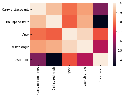
Regarding our dataset, the more the color is white, the stronger the correlation between caracteristics of our data set is high.
Here, we can observe that the Carry distance (meters) is hightly correlated to Ball Speed and Launch Angle, meaning faster shots and higher launch generally add distance.
We can notice also that the Carry distance is less correlated to the Apex (how high fly the ball).
Then, it helps us to decide which features of the dataset is important. For this, we had a limit of a correlation coefficient of 0,4. It means that we exclude all features where correlation coefficient is not strong enough to be relevant.
We can then tell that Ball Speed and the Launch angle have nearly no impact on the Dispersion of the ball.